Emergency Relief App
Emergency Relief App
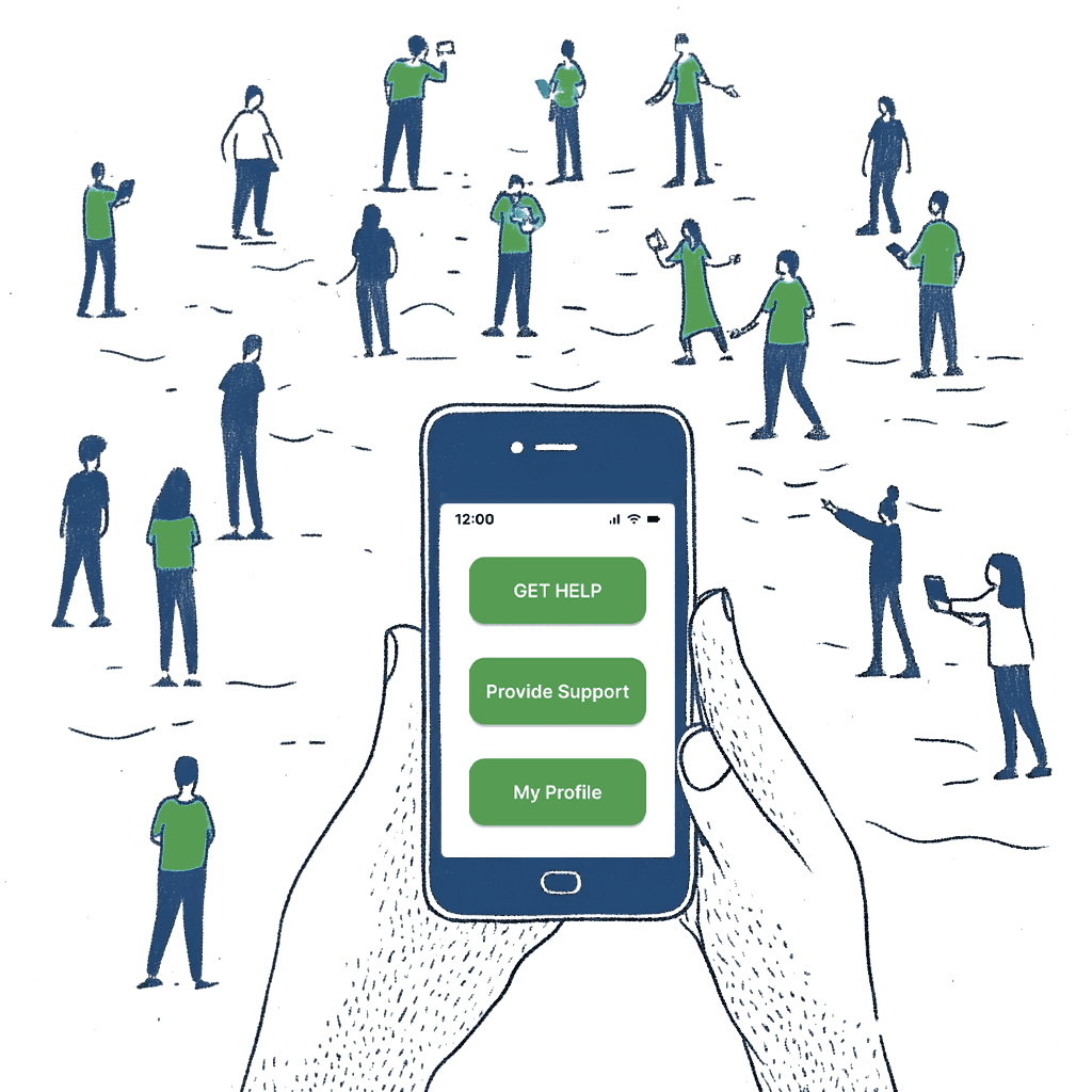
The Emergency Relief mobile app connects people affected by natural disasters with supporters, aid organisations, and essential supplies. Designed for use in high-stress crisis situations, the app allows anyone — including non-tech-savvy users — to request help, donate goods, and track aid through a simple interface. The core challenge was designing for extreme stress conditions — users in crisis situations who may have limited access to the internet, limited phone battery, and no time to learn a new interface.
The Emergency Relief mobile app connects people affected by natural disasters with supporters, aid organisations, and essential supplies. Designed for use in high-stress crisis situations, the app allows anyone — including non-tech-savvy users — to request help, donate goods, and track aid through a simple interface. The core challenge was designing for extreme stress conditions — users in crisis situations who may have limited access to the internet, limited phone battery, and no time to learn a new interface.


Case Study
Case Study
Discover
Define
Discover
Define
Competitive Analysis | (ai) ChatGPT

Comment
Six competitors were analysed across five criteria: app availability, customisable support, international availability, interface quality, and goods donation. The matrix revealed that no existing service had all five simultaneously — this gap directly justified the decision to design a new product rather than recommend an existing one.
Competitive Analysis | (ai) ChatGPT
StoryBoard | (ai) MidJourney

Comment
The MidJourney storyboard visualises the end-to-end user journey from the moment a family is affected by flooding through to receiving medical support and preparing for recovery. Eight scenes were chosen to cover the emotional arc of the experience — not just the functional steps — helping stakeholders understand the human context before seeing any UI.
StoryBoard | (ai) MidJourney
Comment
The MidJourney storyboard visualises the end-to-end user journey from the moment a family is affected by flooding through to receiving medical support and preparing for recovery. Eight scenes were chosen to cover the emotional arc of the experience — not just the functional steps — helping stakeholders understand the human context before seeing any UI.
Value Proposition Canvas

Comment
The Value Proposition Canvas mapped customer jobs, pains, and gains against the proposed products, pain relievers, and gain creators. The key insight from this exercise was that users needed both a tool to describe exactly what they required and a reliable claim system for insurance — two needs that existing solutions treated separately or ignored entirely.
Value Proposition Canvas
Comment
The Value Proposition Canvas mapped customer jobs, pains, and gains against the proposed products, pain relievers, and gain creators. The key insight from this exercise was that users needed both a tool to describe exactly what they required and a reliable claim system for insurance — two needs that existing solutions treated separately or ignored entirely.
Persona Ana

Persona Ana
Persona Robert

Comment
Robert’s goals — protecting his family, accessing insurance quickly, and receiving the right supplies — shaped the customisable order flow and the order tracking feature. His frustration of receiving too many shoes but not enough blankets directly informed the competitive analysis criteria. Ana drove every accessibility decision in the app — minimum 52px touch targets, 15px body text, simplified navigation, and the SMS AI agent as a fallback channel for users who cannot reliably use a smartphone during a crisis.
Persona Robert
Comment
Robert’s goals — protecting his family, accessing insurance quickly, and receiving the right supplies — shaped the customisable order flow and the order tracking feature. His frustration of receiving too many shoes but not enough blankets directly informed the competitive analysis criteria. Ana drove every accessibility decision in the app — minimum 52px touch targets, 15px body text, simplified navigation, and the SMS AI agent as a fallback channel for users who cannot reliably use a smartphone during a crisis.
Solutions
Radio News
Put a white item outside the window if you need basic necessities—water, food; a colourful item if you need medicine.

App Idea
Service connecting affected by natural disaster with supporters. Tool to make customise fundraisers.
AI Agent
Correspond with an AI agent via SMS, making support accessible for users who are not tech-savvy.
Three potential solutions were considered during the ideation phase: a radio signal system for offline communication, a mobile app connecting donors with those in need, and an SMS AI agent for non-tech-savvy users. The mobile app was chosen as the primary solution because it enables real-time, personalised, two-way requests rather than one-way broadcast communication. The SMS agent was retained as an accessibility channel rather than discarded.
Develop
Develop
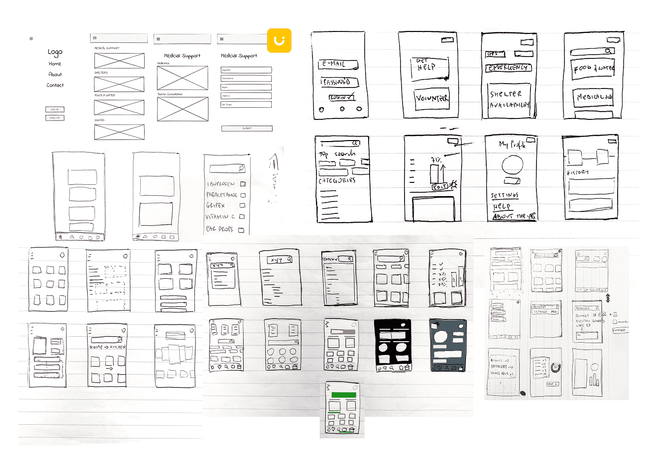
Sketches | (ai) Uizard
Comment
Hand-drawn sketches explored different structural approaches before any digital work began. Sketching at this stage deliberately avoided commitment to any visual direction — the focus was purely on information architecture, navigation patterns, and the relationship between the Get Help and Provide Support flows. Key decisions made at this stage included the bottom tab navigation and the category-first approach to content organisation.
LoFi Wireframes

Comment
The lo-fi wireframe set covers the full product — registration, profile, receiving help, providing support, food ordering, medical support, shelter finding, and order tracking. Designing all screens in greyscale before applying any visual treatment ensured that hierarchy and usability decisions were made independently of aesthetic ones. The isometric overview presentation was chosen to communicate the breadth of the design system at a glance.
LoFi Wireframes
Comment
The lo-fi wireframe set covers the full product — registration, profile, receiving help, providing support, food ordering, medical support, shelter finding, and order tracking. Designing all screens in greyscale before applying any visual treatment ensured that hierarchy and usability decisions were made independently of aesthetic ones. The isometric overview presentation was chosen to communicate the breadth of the design system at a glance.
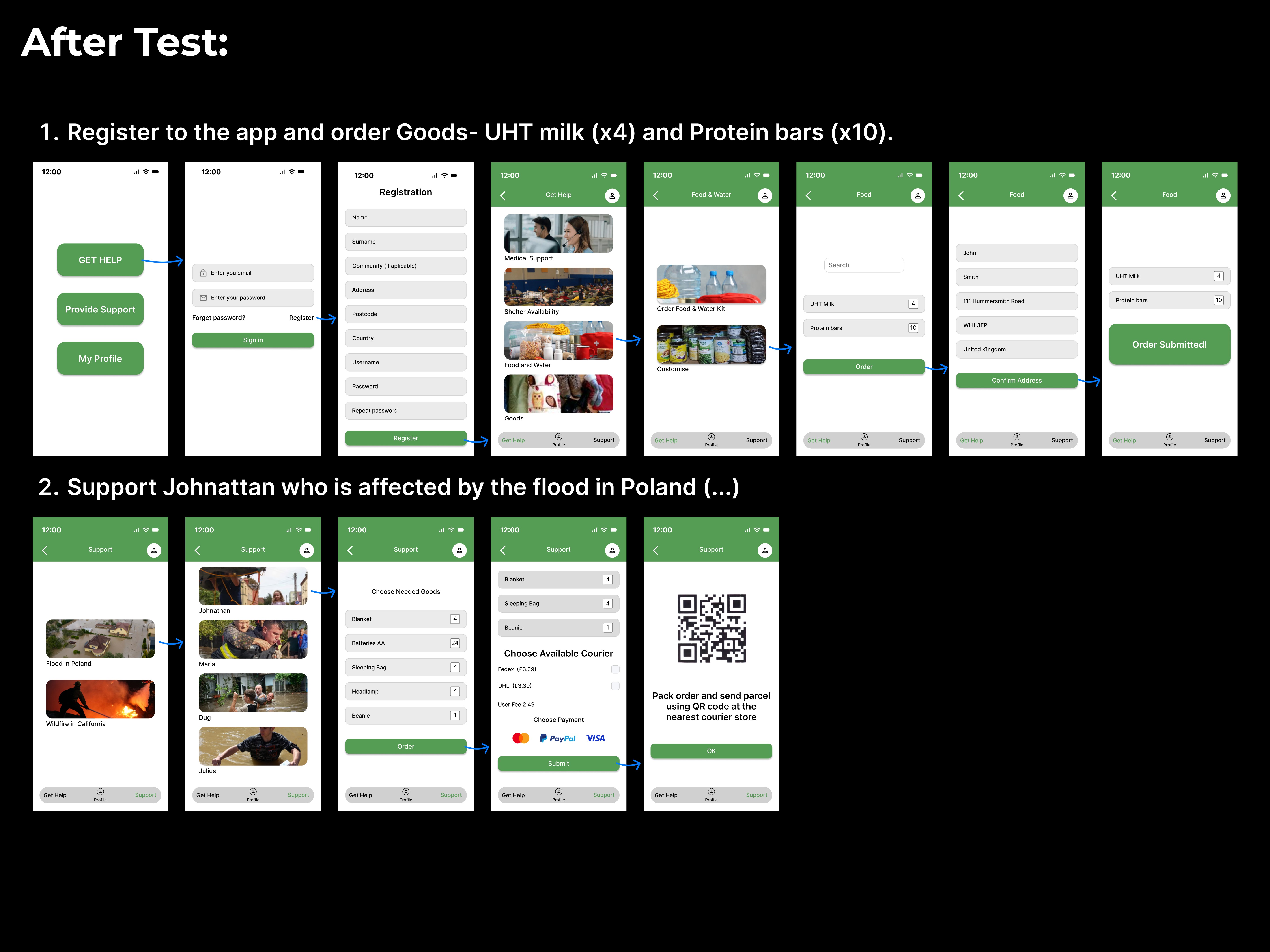
First Usability Tests

First Usability Tests
Comment
Following usability testing, several significant changes were made. The category screen gained photography to aid recognition for users with lower literacy. The registration flow was simplified by removing the Username field, reducing friction at the most critical onboarding step. The courier selection and payment options were surfaced earlier in the order flow based on tester feedback that they were unexpected at the end.
Style Guide | (ai) Colormind
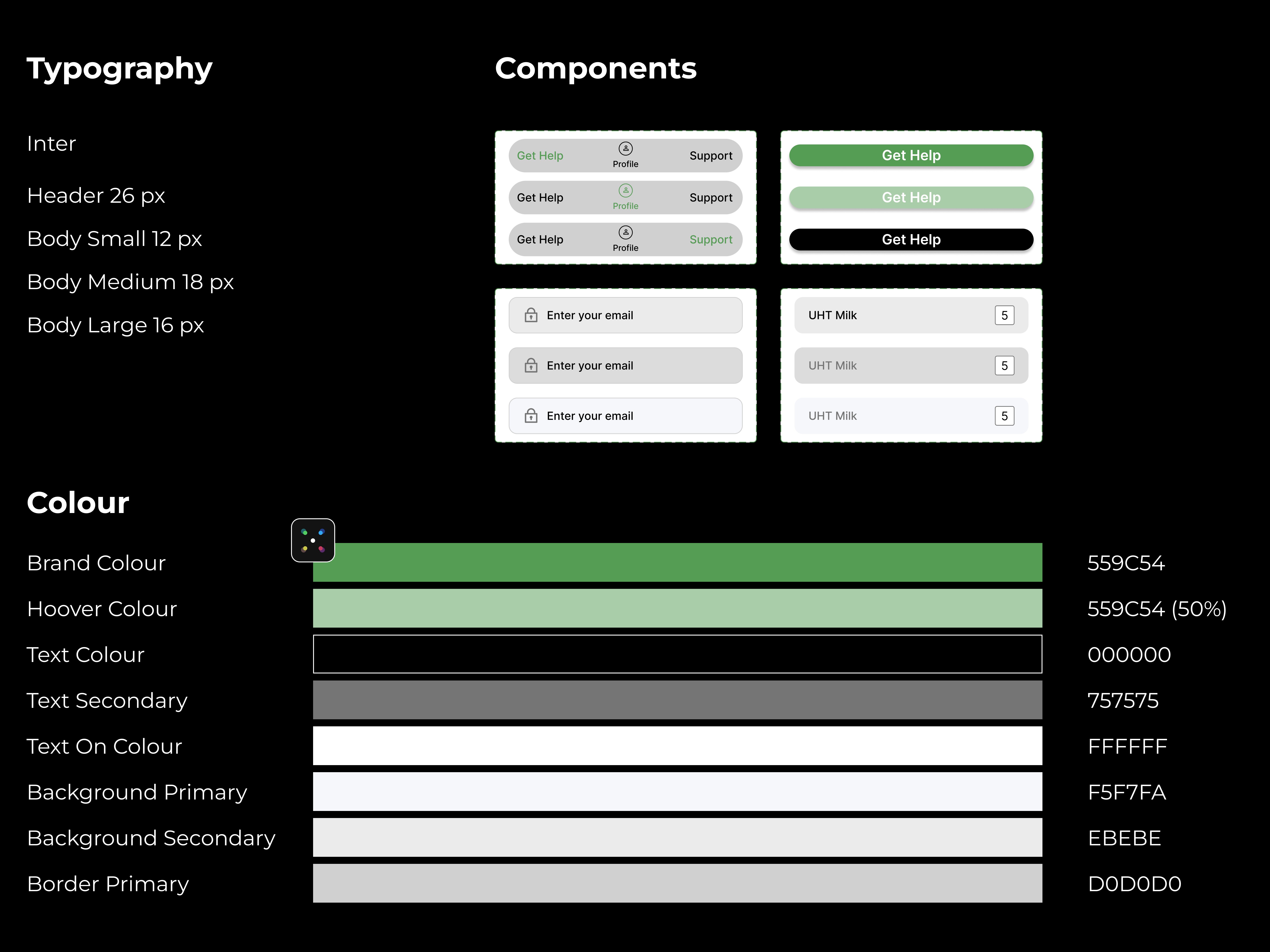
Comment
The style guide established the visual system before high-fidelity screens were designed. The brand colour #559C54 was chosen to communicate nature, health, and safety — associations directly relevant to a humanitarian relief product. The colour system was kept deliberately minimal: one brand colour, one hover state, black and grey for text, and neutral backgrounds — to ensure accessibility contrast ratios were met across all combinations.
Style Guide | (ai) Colormind
Comment
The style guide established the visual system before high-fidelity screens were designed. The brand colour #559C54 was chosen to communicate nature, health, and safety — associations directly relevant to a humanitarian relief product. The colour system was kept deliberately minimal: one brand colour, one hover state, black and grey for text, and neutral backgrounds — to ensure accessibility contrast ratios were met across all combinations.
Mobile Sitemap

Comment
The mobile sitemap documents the full navigation architecture across three entry points: Help, My Profile, and Support. Each branch was mapped to ensure no user journey required more than three taps to reach the most critical actions — food ordering, medical support, and shelter finding. The sitemap was built after wireframing rather than before, to reflect the architecture that emerged from testing rather than the architecture that was assumed at the start.
Mobile Sitemap
Comment
The mobile sitemap documents the full navigation architecture across three entry points: Help, My Profile, and Support. Each branch was mapped to ensure no user journey required more than three taps to reach the most critical actions — food ordering, medical support, and shelter finding. The sitemap was built after wireframing rather than before, to reflect the architecture that emerged from testing rather than the architecture that was assumed at the start.
Deliver
Deliver
Final Design
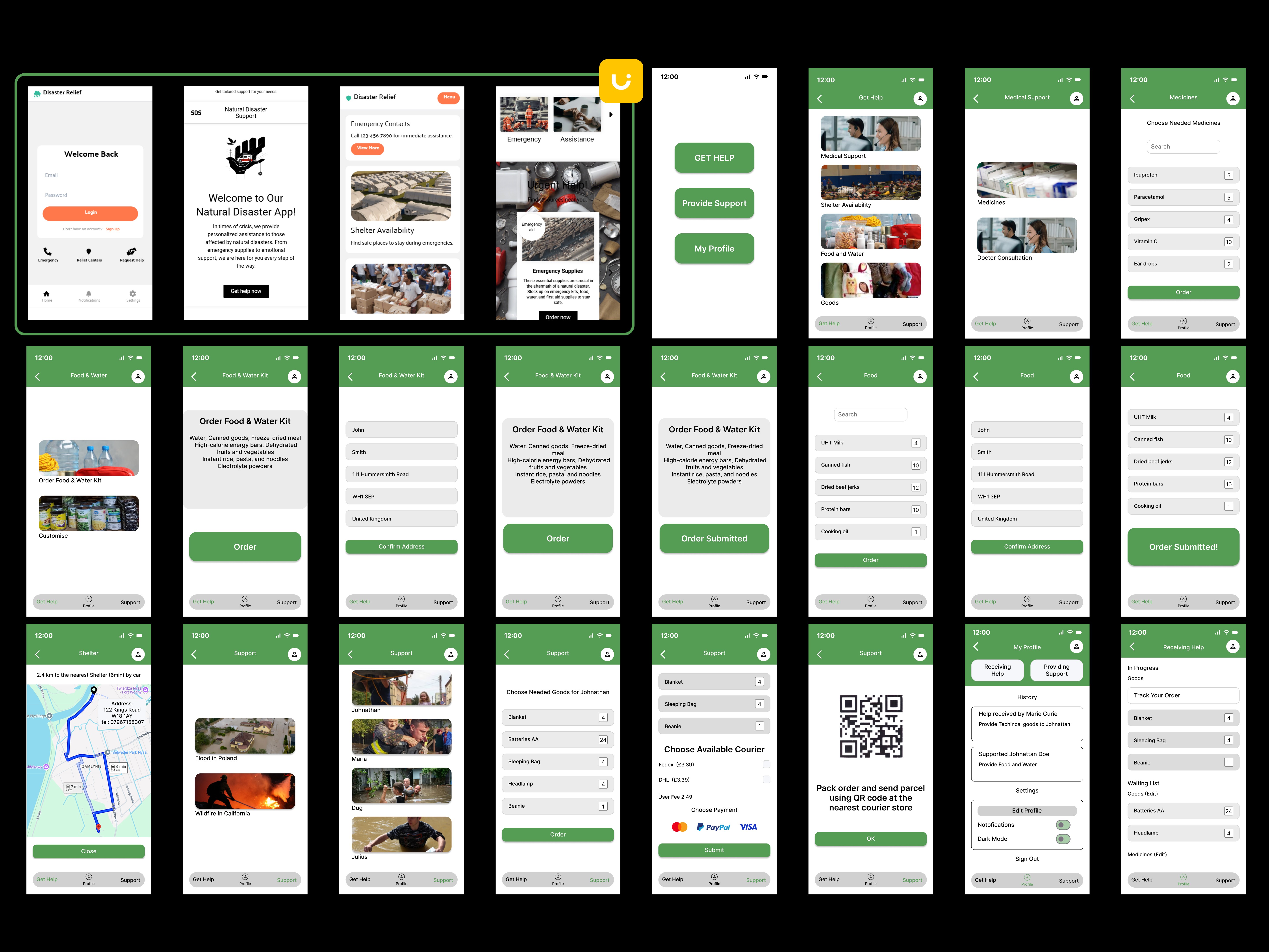
Comment
The final design overview shows the complete screen set across all three primary flows. The consistent application of the green header, bottom navigation, and card system across every screen demonstrates a coherent design system rather than individually designed screens. Following senior designer feedback, the header colour, button hierarchy, spacing system, and home screen composition were subsequently redesigned to address four recurring visual issues.
Final Design
Comment
The final design overview shows the complete screen set across all three primary flows. The consistent application of the green header, bottom navigation, and card system across every screen demonstrates a coherent design system rather than individually designed screens. Following senior designer feedback, the header colour, button hierarchy, spacing system, and home screen composition were subsequently redesigned to address four recurring visual issues.
A/B Test

Comment
The A/B test focused on a specific navigation problem identified during testing: users could not reliably locate their Receiving Help and Providing Support details. Version A used a single Assist Management button leading to one long scrollable screen. Version B used explicit tab navigation with both modes visible simultaneously. Version B was chosen as the final design based on measurably faster task completion — not personal preference.
A/B Test
Comment
The A/B test focused on a specific navigation problem identified during testing: users could not reliably locate their Receiving Help and Providing Support details. Version A used a single Assist Management button leading to one long scrollable screen. Version B used explicit tab navigation with both modes visible simultaneously. Version B was chosen as the final design based on measurably faster task completion — not personal preference.
User Flow - Registration and Customised Order of Medicines
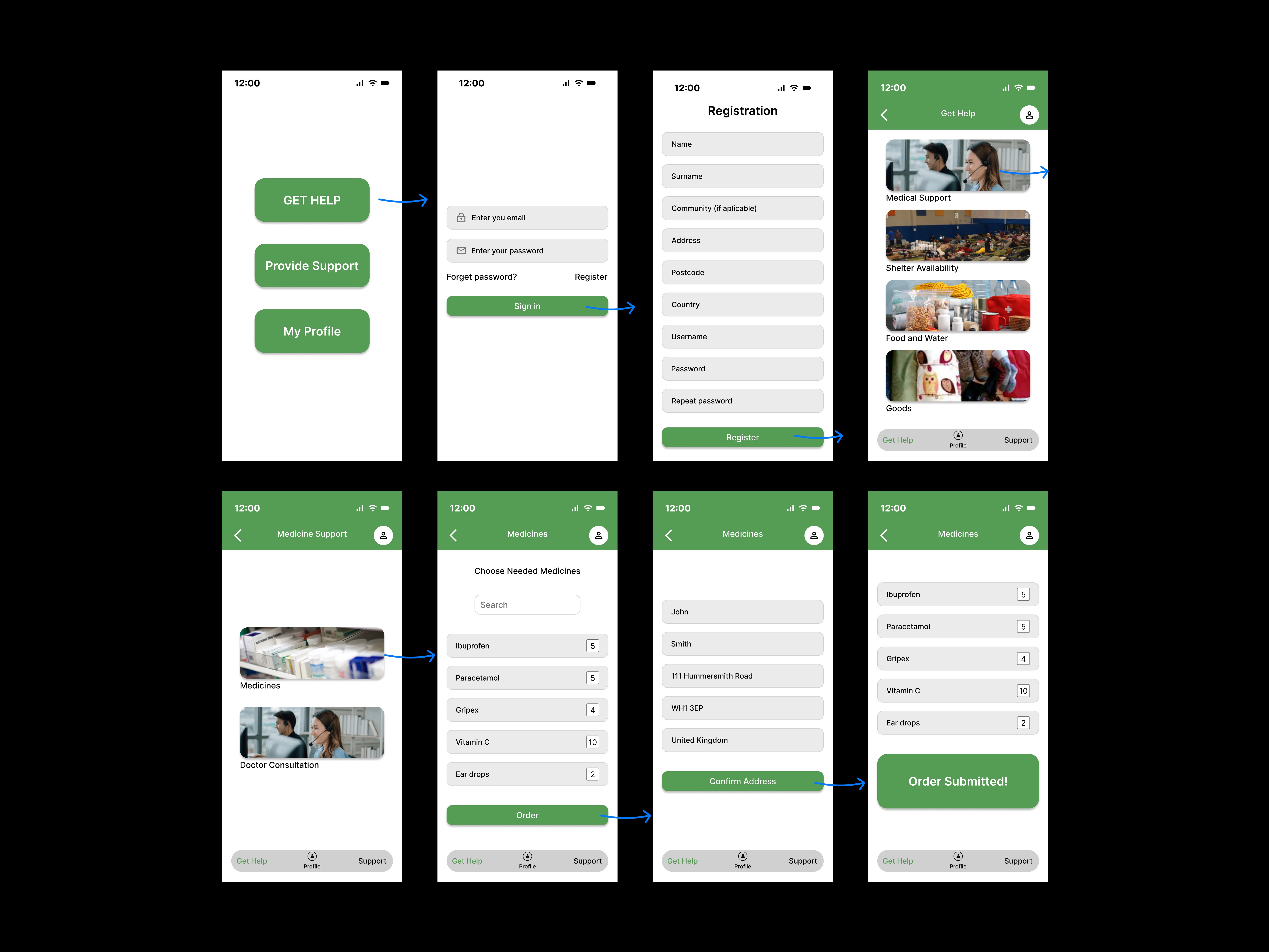
User Flow - Registration and Customised Order of Medicines
Order of Food & Water Kit
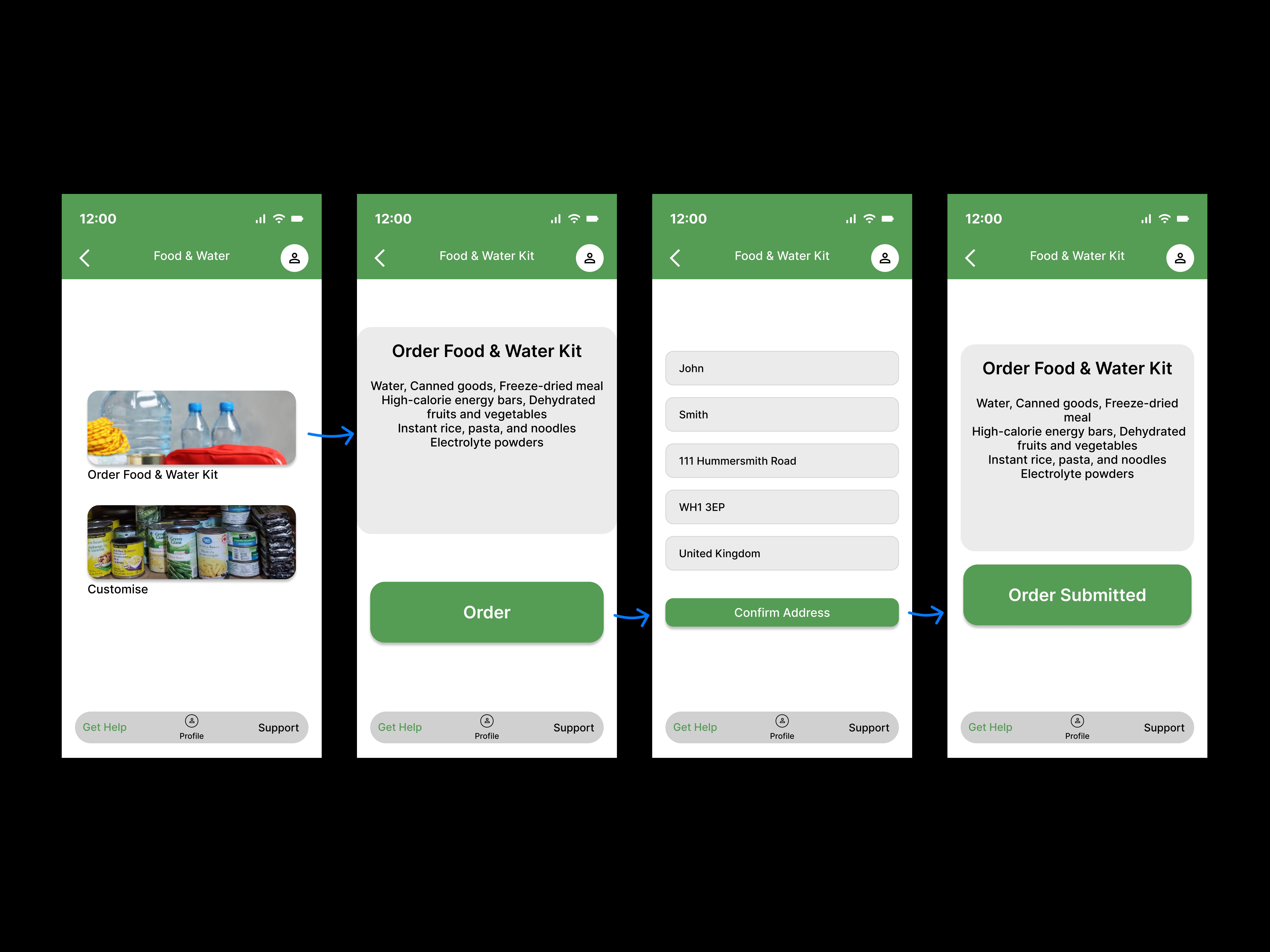
Order of Food & Water Kit
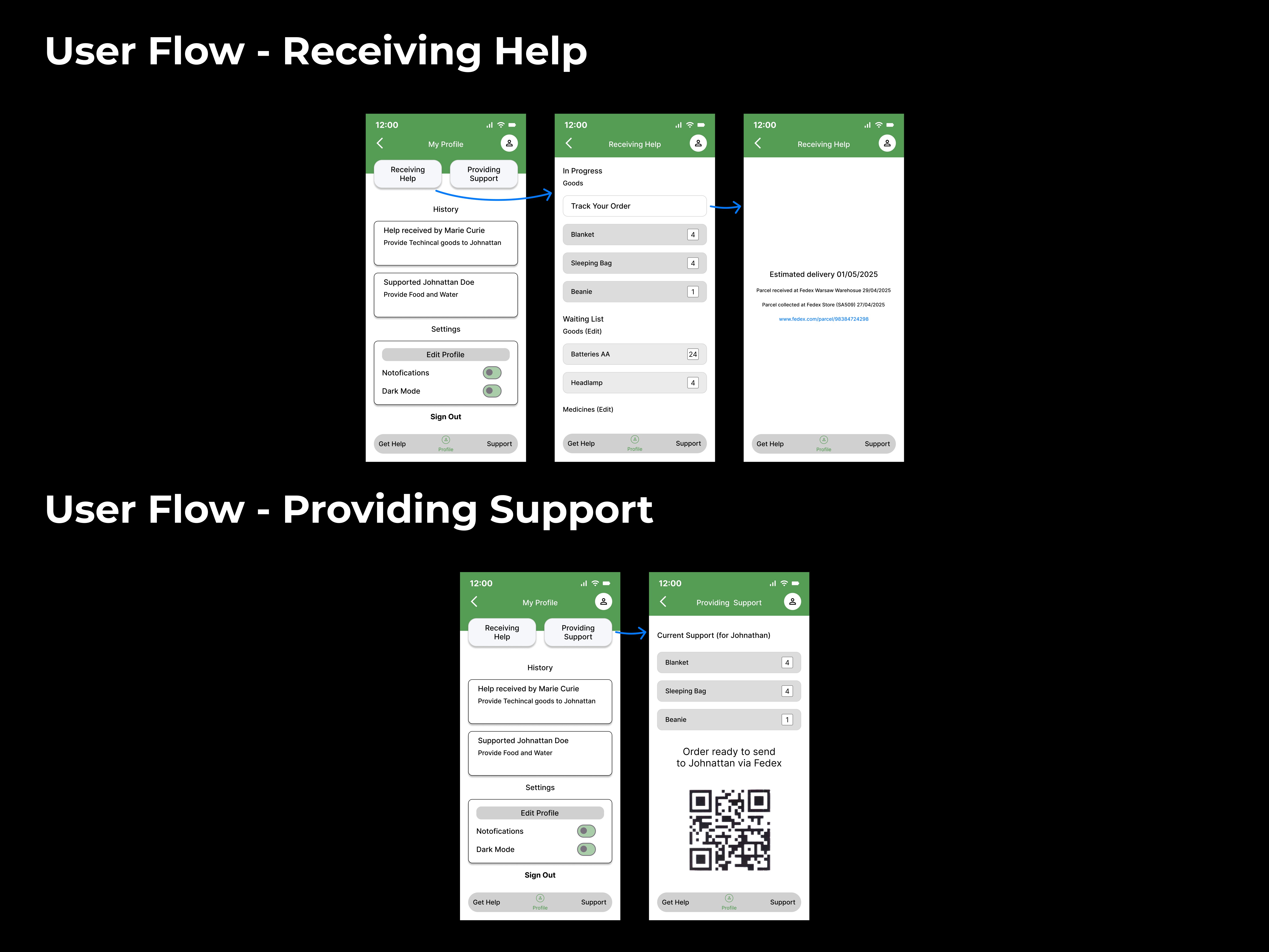
User Flow - Track Ordered Parcel

User Flow - Track Ordered Parcel
User Flows
User Flows
User Flows